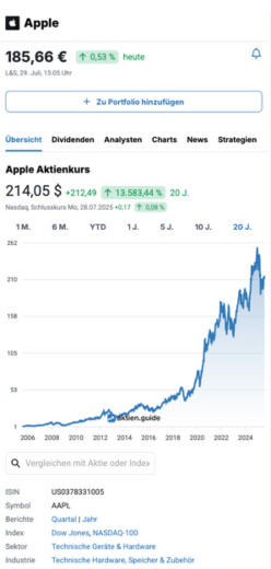
Compare stock charts & stock metrics
With the stock charts tool from StocksGuide you can view approx. 40 metrics for 7,084 stocks over the course of history. You can also compare several stocks with each other in a chart (e.g. price, valuation, growth and much more). This allows you to identify specific investment opportunities and determine potential buy or sell opportunities based on a direct comparison of metrics.
Please log in to use charts. Get Started for Free Today

Charting Tool: This is how it works!
Welcome to StocksGuide chart comparison - the fastest way to compare stocks, prices, ratios and indices quickly and intuitively. With our user-friendly tool, you are in control of the charts and can compare stocks the way you want. Watch our short video to see how easy it is:
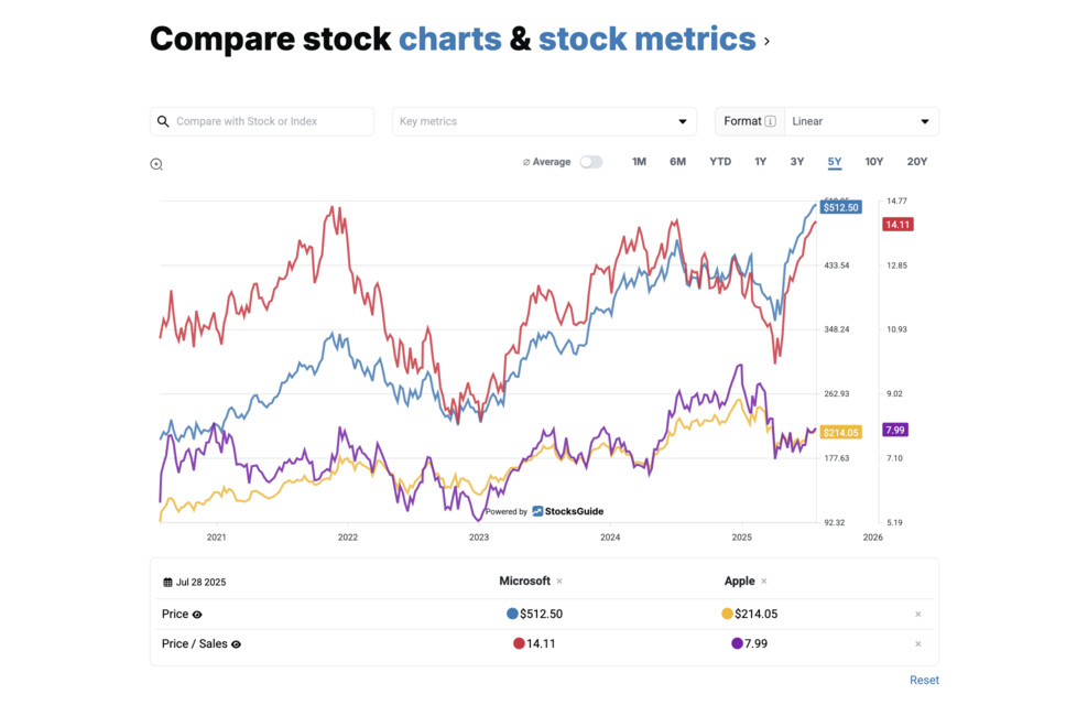
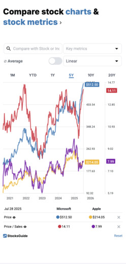
Chart comparison: Compare stock charts and metrics with different display formats
In just a few seconds you can create an individual chart comparison and compare securities or indices. You can use the "Stock, Index" search field to search for and select stocks or an index and add them to the chart comparison. You can select a suitable display format using the "Display" field.
Original (unchanged)
With this format, the actual values are displayed in the chart without being changed.
Normalized (% change)
The normalized format shows all values in percentage terms (compared to the initial value at the beginning of the period under review). You can use this format, for example, to view the stock price performance as a percentage. The normalized presentation is particularly suitable for comparing several companies with each other. This format can also be used for different currencies. For metrics that are already expressed as a percentage (e.g. EBIT margin or sales growth), the normalized presentation is not useful.
Underwater
The underwater format shows the distance of the stock price from the all-time high in the period under review as a percentage. This format is helpful to see how far a stock is from its all-time high and how much it has fluctuated over time. How you can use underwater charts ➜
Register for Free
StocksGuide is the ultimate tool for easily finding, analyzing and tracking stocks. Learn from successful investors and make informed investment decisions. We empower you to become a confident, independent investor.